
Friday, August 8, 2008
Hypsometric map...
Hypsometric maps show relief feature on the planet's surface. This map is of the Aegean Sea.

Line graph...
This line graph includes information about units of production and the month in which they were produced for different products. This type of graph is easy to read and comprehend.

Classed chloropleth...
This classed chlorpleth inclues information about a mayoral election. It is classed because it has more than one category with distinct color coding.

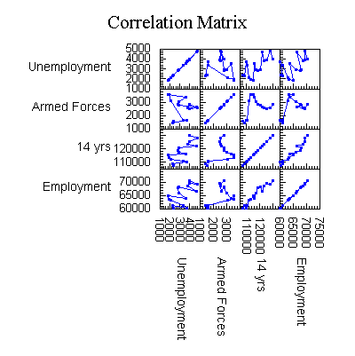
A similarity matrix...
This is the only similarity matrix I could find...similarity matrices usually deal with genes.


A Lorenz curve...
I took an economics class this semester where we had to deal a lot with the Lorenz curve.


Thursday, August 7, 2008

A histogram...

A histogram is a bar graph that represents frequencies. The histogram above represents information from the 2000 Census and compares the population of an area with the travel time.
A windrose...

Windroses give information about wind speed and direction at a given location. The windrose above represents the Fresno Air Terminal.
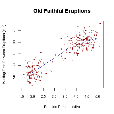
A scatterplot...
The scatterplot below displays variables relating to Old Faithful eruptions. The y-axis represents the waiting time between eruptions and the x-axis represents the length of the eruption.
A population pyramid...
I had to work extensively with population pyramids in a sociology class I took last semester. The pyramid below represents China in 2005 and the effects of their One Child Policy. I had to do a project on Sierra Leone and their population pyramid was the most dramatic I'd seen.

A DOQQ...

A DOQQ is a digital image created by an aerial photo. These images are much more accurate than aerial photographs because certain displacements the camera can cause (like tilt) are removed through rectification. Above is a DOQQ of Las Vegas.
A DEM...

A DEM is a digital elevation model, which contains geographic data in raster form. DEMS are made from contour lines.
A DLG...

A DLG is a digital line graph contains digital vector data that depicts geographic features. It can tell the viewer information about roads, utility lines, hypsography and more.
A DRG...
A DRG is a scanned image of a USGS topographic map. This image comes directly from the USGS website.

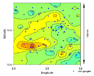
An isopleth...
Isopleths are any map with continuous lines that show the frequency of something happening. I found this set interesting because of its age...it is hand drawn.


A LiDAR image...
This is a LiDAR image of San Diego, California. The red area signifies the mountains...I'm still amazed at this technology and what it is capable of.

A doppler radar picture...
This was the current doppler image in Tampa, where I live, at the time I was making the catalog. As you can see, it was an uncharacteristically dry day in the bay area, with only a small spot of storms.


An infrared aerial shot...
This infrared picture is of the Missisippi River. You can see the red foliage on the left and the blue parking lot and buildings on the right.

Statistical map...
This statistical map provides information on which states return the most profit on their electric bills. It goes by kilowatt-an-hour billing and determines how many cents a customer pays above the actual price of the good.

An isoline map...
Isoline maps are maps with continuous lines joining to symbolize some aspect of the environment. I found a website on which the author posted a number of stamps with different isoline images. This is a contour isoline map.

A cartogram...
This cartogram is rather fitting with current issues dealing with global footprints. Based on ecological consumption, it proportionally exaggerates the size of those countries whose global footprints are largest.

A flow map...
Flow maps remind me of when I was in elementary school and had to draw what seemed like one a day for years. This one lets you know how to make a peanut butter sandwich step by step...

A proportional circle map...
This proportional circle map was published after the 1970 census. It was meant to represent what the population would look like based on the results. 

A dot distribution map...
I thought this dot distribution map was pretty funny in that it represents the locations and sales branches for the first potato chip manufacturer. I've never even heard of Red Dot before, but I guess they're pretty famous in Wisconsin!

Sunday, June 22, 2008
A chloropleth map...
 This is a classfied chloropleth map I found on Google. It's classified because it's broken up into five separate categories of distinction according to color variations.
A propaganda map...
This map is an example of a propaganda map because it is using "journalistic" cartography to illustrate the potential threat of the spread of Communism. This map was published during the Cold War. http://www.newberry.org/smith/slidesets/images/vs1_3_tn.jpg
 http://www.newberry.org/smith/slidesets/images/vs1_3_tn.jpg
A PLSS map...
 According to the website, this map is a combination map. Both Civil Townships and PLSS Townships are represented. It is classified as a PLSS due to its breakdown of land ownership on the grid.
http://www.rootsweb.ancestry.com/~iaharris/twp/rangemap.htm
A cadastral map...
 This is a cadastral map that shows the boundaries of land ownership as well as geographical landmarks. Cadastral maps are usually broken down for taxation purposes.
A thematic map...

A topographic map...
This is a topographic map of South America, primarily focusing on Brazil. Of all of the types of topographic maps, I prefer those that visually represent geological landmarks

A planimetric map...
This planimetric map of Iraq is considered to fall into this category because it is basically a street map providing locations.

Friday, May 9, 2008
A mental map...
 I found this mental map interesting because of the author's attention to detail based on nostalgia. From the apple tree where "I made mud pies" to the "porch where hobos came to ask for coffee and sandwiches", this representation of the mind's perception of geography is a prime example of its kind.
http://www.uky.edu/~ulack/Geo152/unnumbered%20figure%20pg%2003.jpg
Subscribe to:
Comments (Atom)